BRAND DESIGN
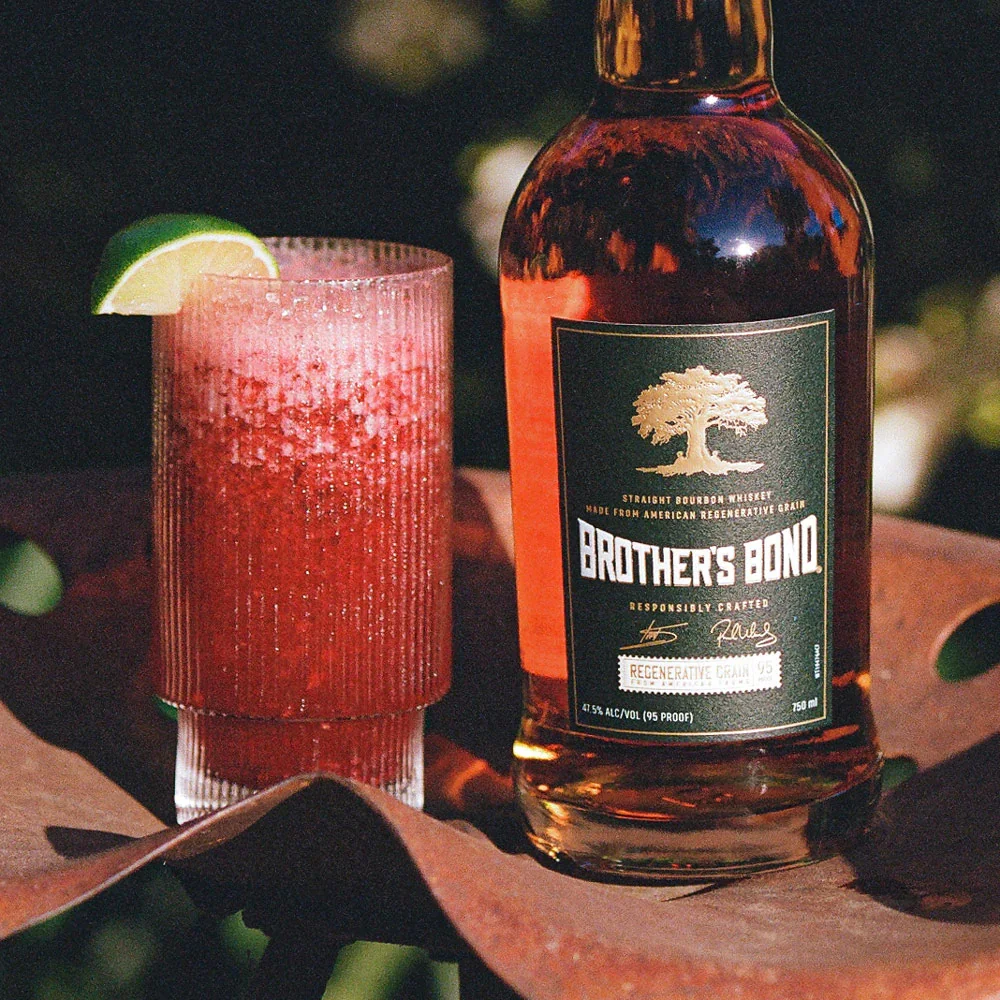
Brother’s Bond
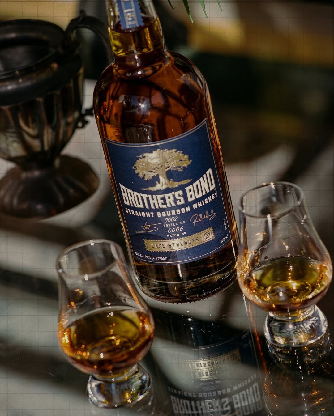
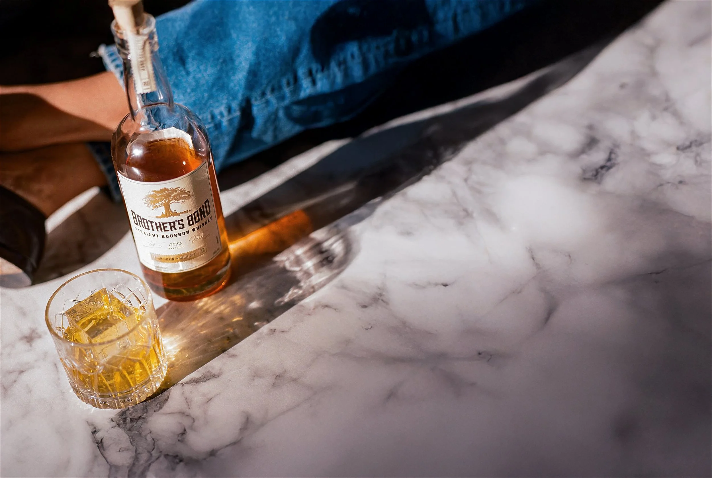
We partnered with Brother’s Bond, the bourbon whiskey brand co-founded by Paul Wesley and Ian Somerhalder, to develop a complete refresh of its brand identity. Rooted in the founders’ shared passion for bourbon and their vision of bringing people together, the brand has grown rapidly and earned recognition in the spirits world. It was the right moment to elevate the visual experience to match the quality of the product.
Our team refined the core identity, evolving the logo into a more timeless, crafted mark and rebuilding the label architecture for clarity, elegance, and stronger shelf impact.
The outcome is a premium, cohesive system that enhances the brand’s presence while preserving its approachable, welcoming character — an identity that reflects the spirit and craftsmanship inside every bottle.
Client
Brother’s Bond
Year
01/07/2025

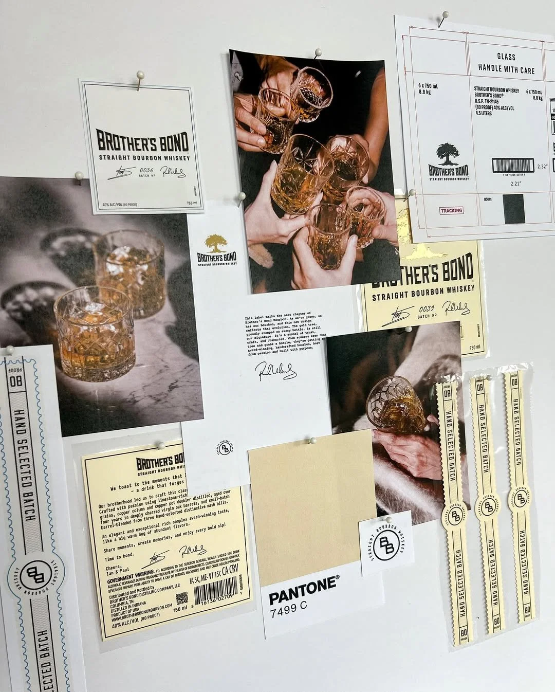
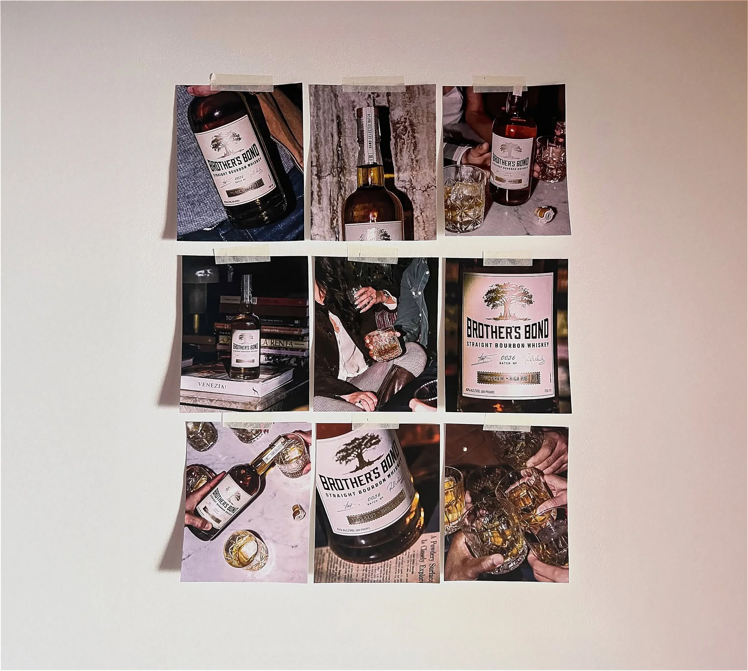
Brief and Concept
The brief was to evolve an already-loved bourbon into a brand that looked as good as it tasted. Brother’s Bond, had become a cult favorite, but its visual identity hadn’t kept pace with its success.
The concept centered on craftsmanship and connection: creating a design language that felt authentic, timeless, and worthy of an award-winning bourbon. The goal was not to reinvent, but to refine; simplifying the logo, elevating the label architecture, and building a visual system that celebrates the bond between people, craft, and shared moments over a great glass of whiskey.
All images, video, trademarks, logos, and likenesses shown on this page are the exclusive property of Brother’s Bond and their respective owners. They are presented here strictly for the purpose of showcasing my design work in a non-commercial, educational portfolio context. No affiliation, partnership, or endorsement by Brother’s Bond, Paul Wesley, Ian Somerhalder, or their representatives is implied.
See More
-
![]()
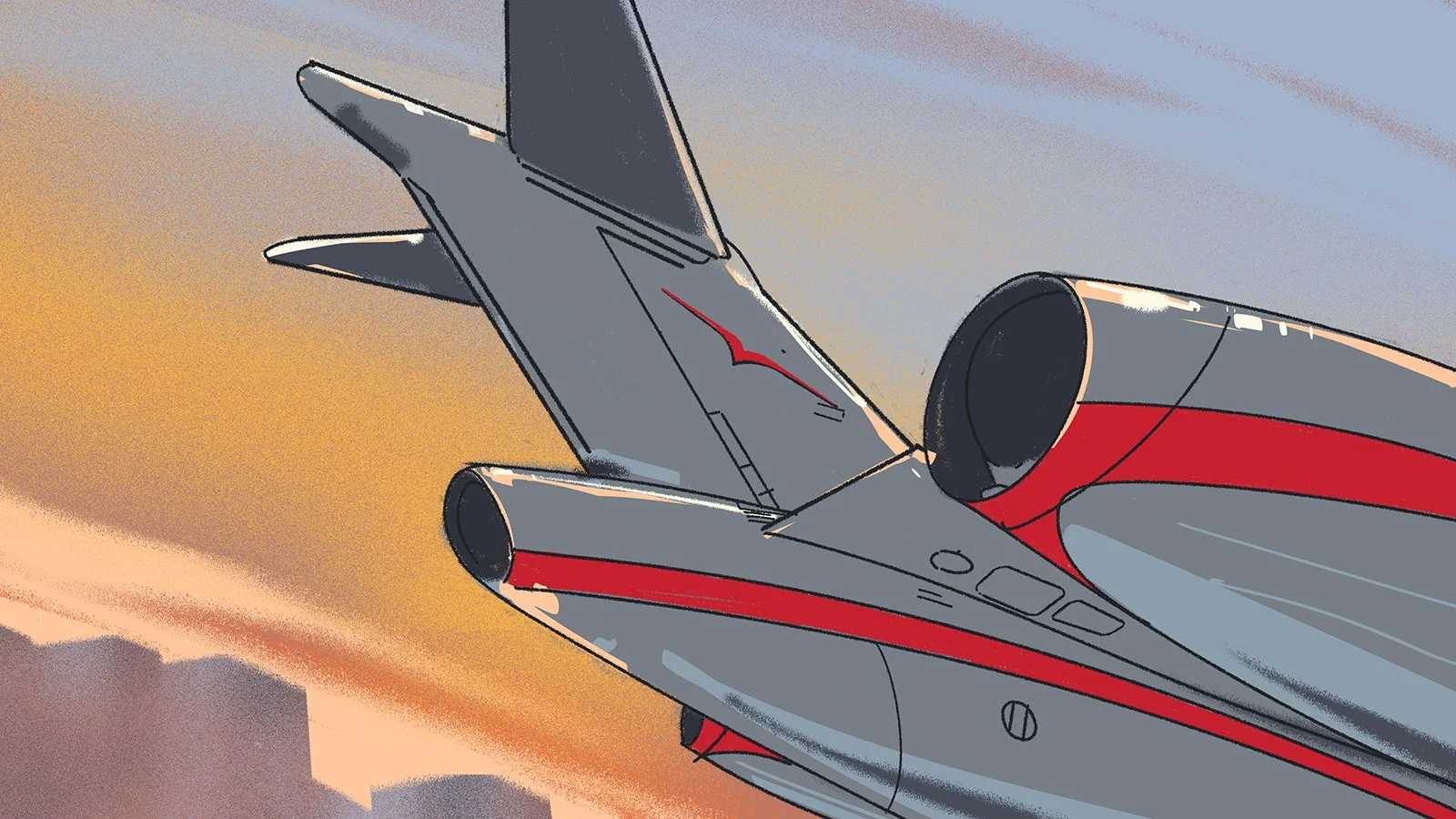
VistaJet Corporate Campaign
A bold reimagination of how private aviation speaks to business. I led the creative direction of this project, collaborating with illustrators Edward Tuckell and Magali Garcia to craft a campaign that replaced predictable corporate footage with a dynamic, illustrated world.
-
![]()
The Only Caviar - by Aaron Paul
Aaron Paul and Diego Sabino’s vision for caviar reborn, with a brand world that reframes tradition in a modern, cultural context.
-
![]()
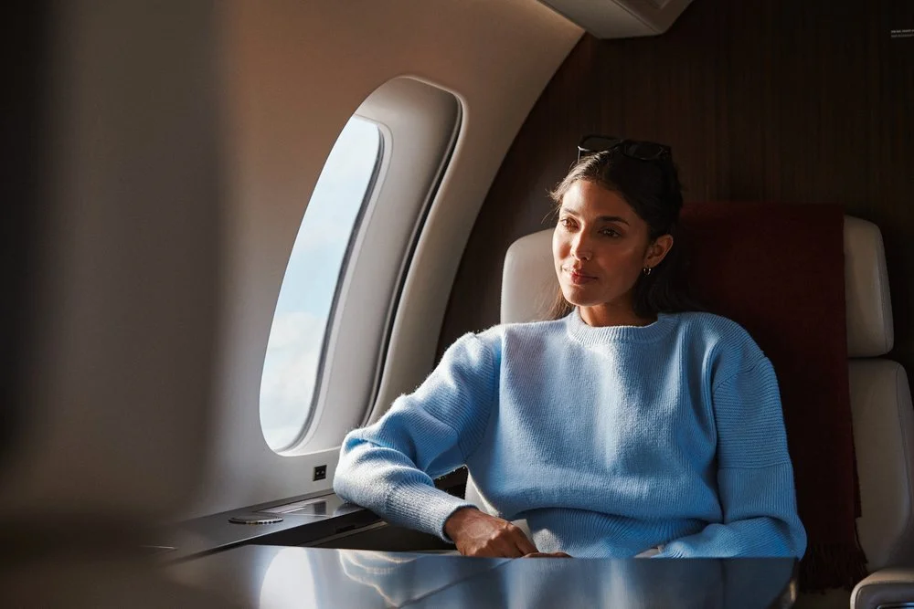
Wellness - VistaJet
A first-of-its-kind program redefining wellbeing in flight. I led the creative direction across film, digital, onboard rituals, and products — crafting a seamless experience that connects pre-flight preparation, in-flight restoration, and post-flight renewal.
-
![]()
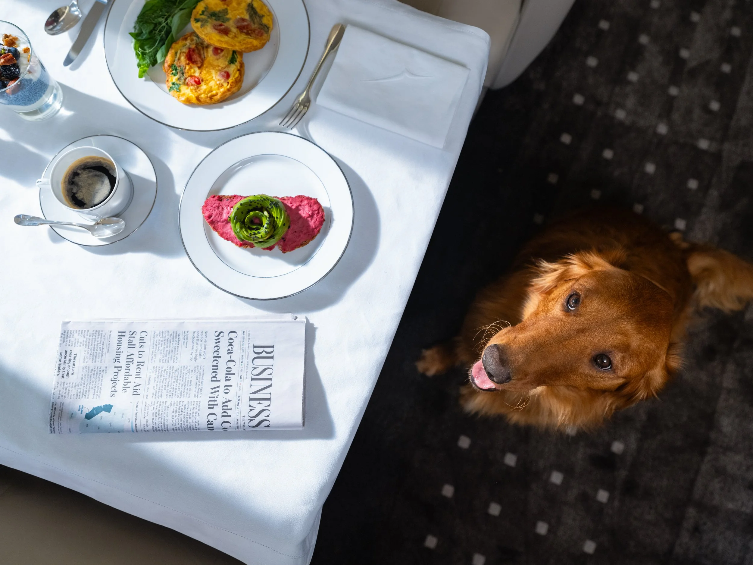
The Sleep Program VistaJet
Redefining how rest is experienced in flight. From concept to photoshoot, film, digital storytelling, and bespoke onboard products, the campaign highlighted science-backed design and rituals that turn travel into restorative sleep.